Art of Tea
Art of Tea committed to putting the art into tea. A ground-up rebrand. Identity, logo and packaging. With a unique pattern for every blend. Still on shelves a decade later.
Before we started, Art of Tea looked like every other tin on the shelf. Dull, bland, forgettable packaging with no art to speak of. For a company that sourced and blended tea like artists, the brand said nothing of the kind.
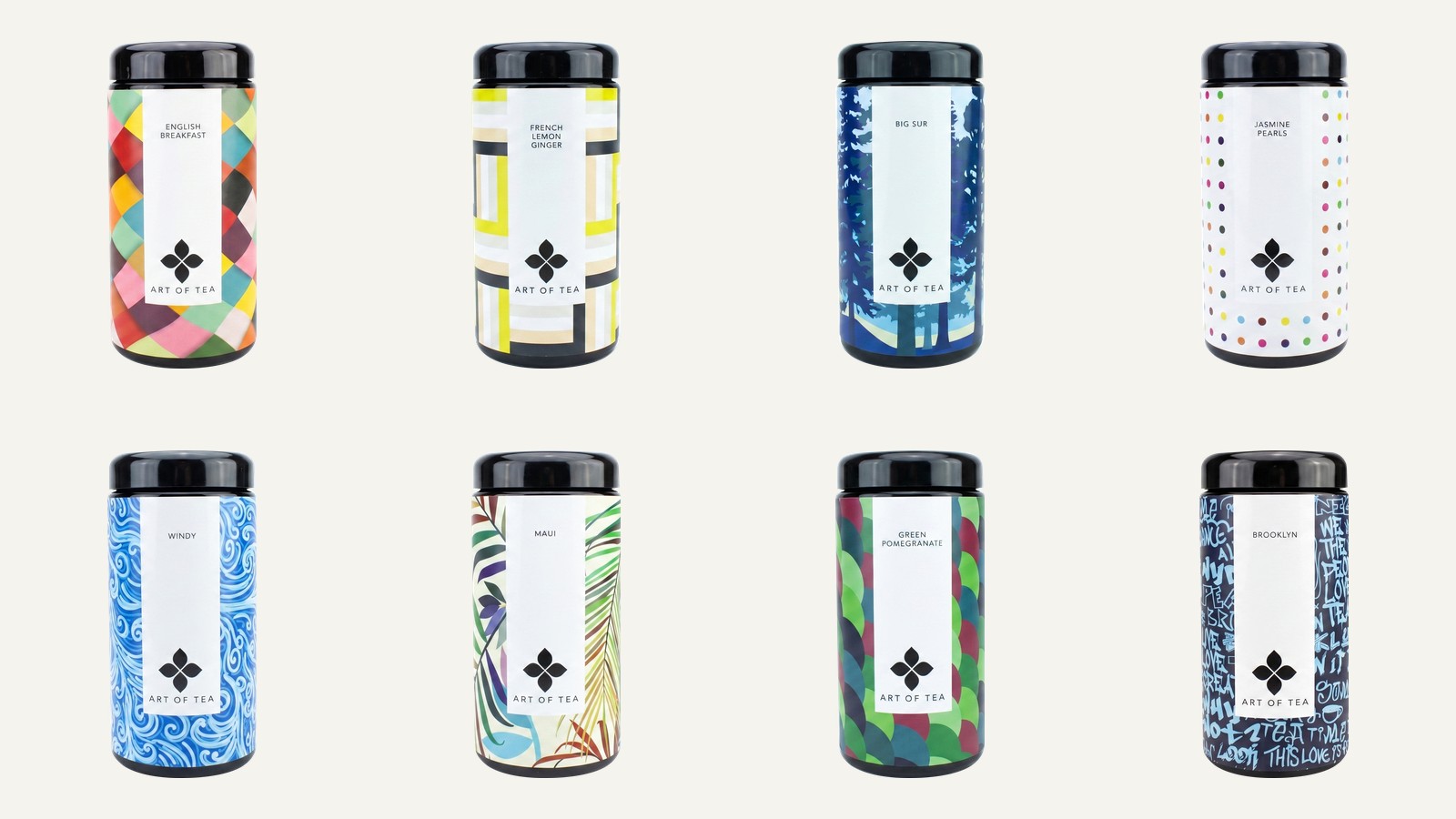
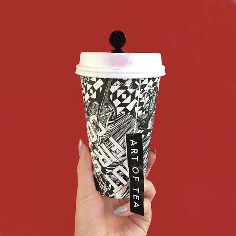
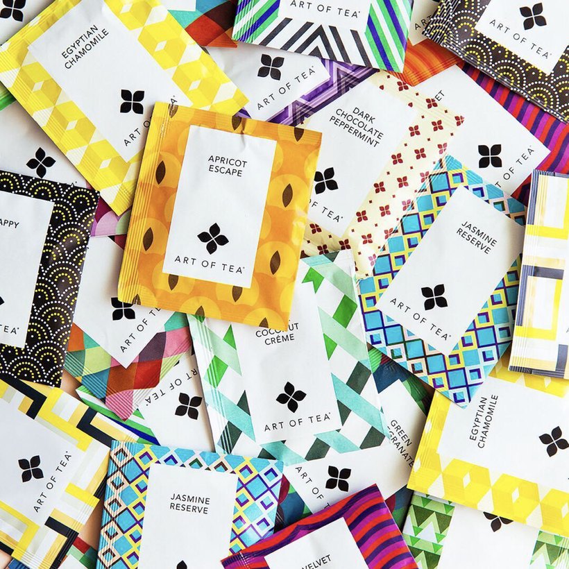
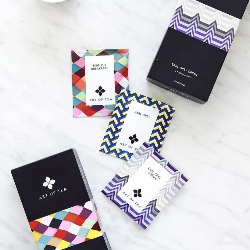
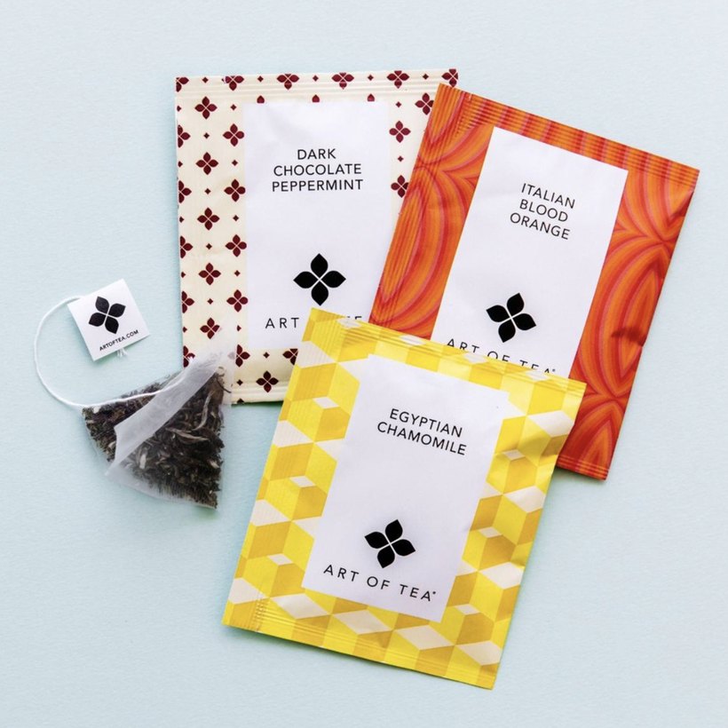
So we rebuilt it from the ground up: a new identity system, a new logo, and packaging for the entire range. Each blend given a distinct, hand-crafted pattern. We put the art back into Art of Tea.
Overview
The partnership
A complete rebrand for the Los Angeles tea house. Identity, logo, and a pattern-driven packaging system across every blend in the range.
Define
The strategy was hiding in the name. Art of Tea blended tea like an art form. But nothing about the packaging showed it. So we made "art" the entire idea, and gave every blend a canvas of its own.
The idea
Put the art into Art of Tea.
Create
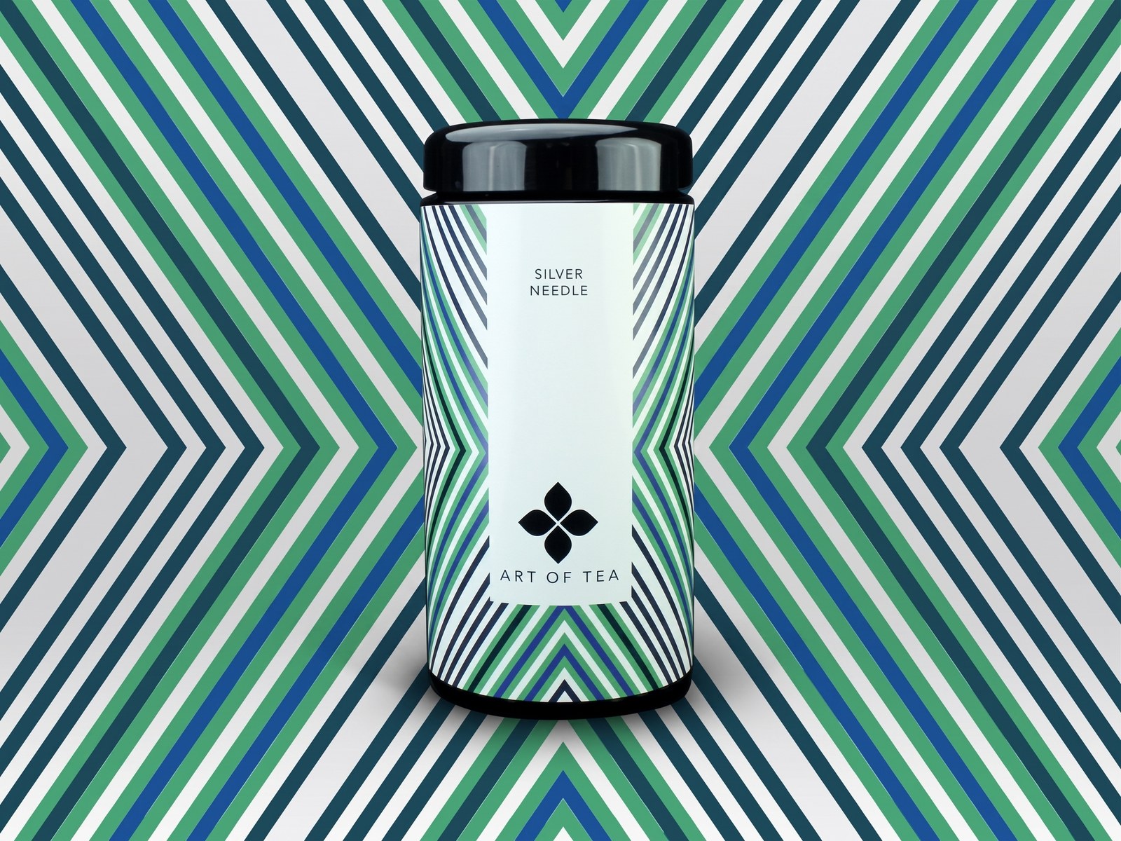
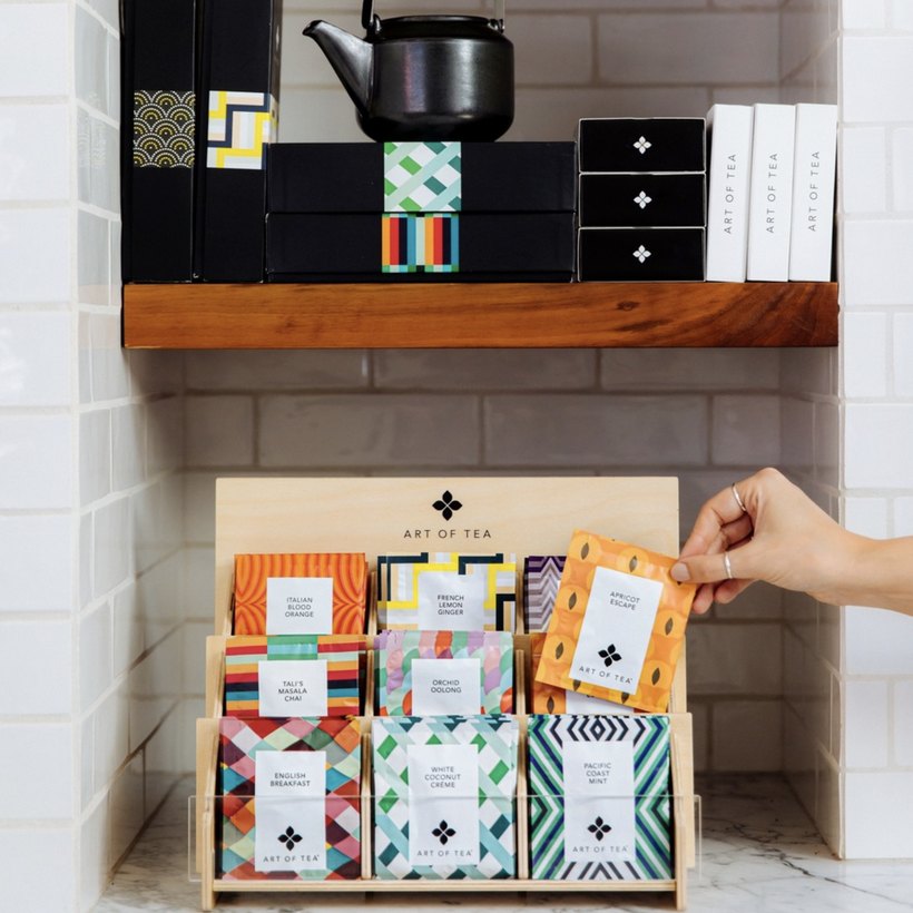
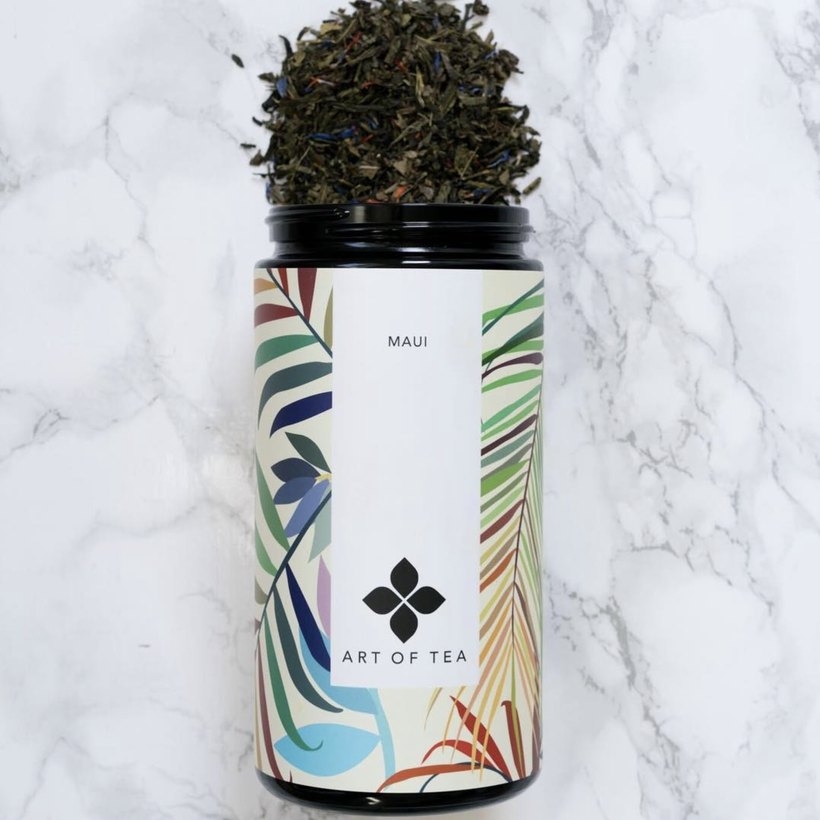
We built a flexible identity system anchored by a single quatrefoil mark and a clean, consistent label. Then we designed a bespoke pattern for every blend. Harlequin diamonds for English Breakfast, a painted forest for Big Sur, tropical botanicals for Maui, hand-lettered type for Brooklyn. Different every time, unmistakably one brand.
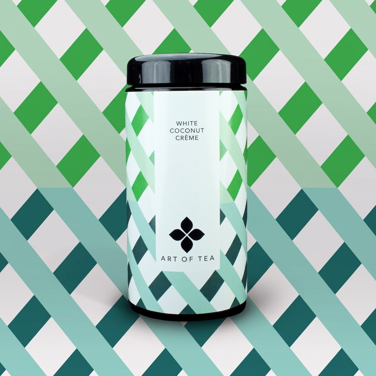
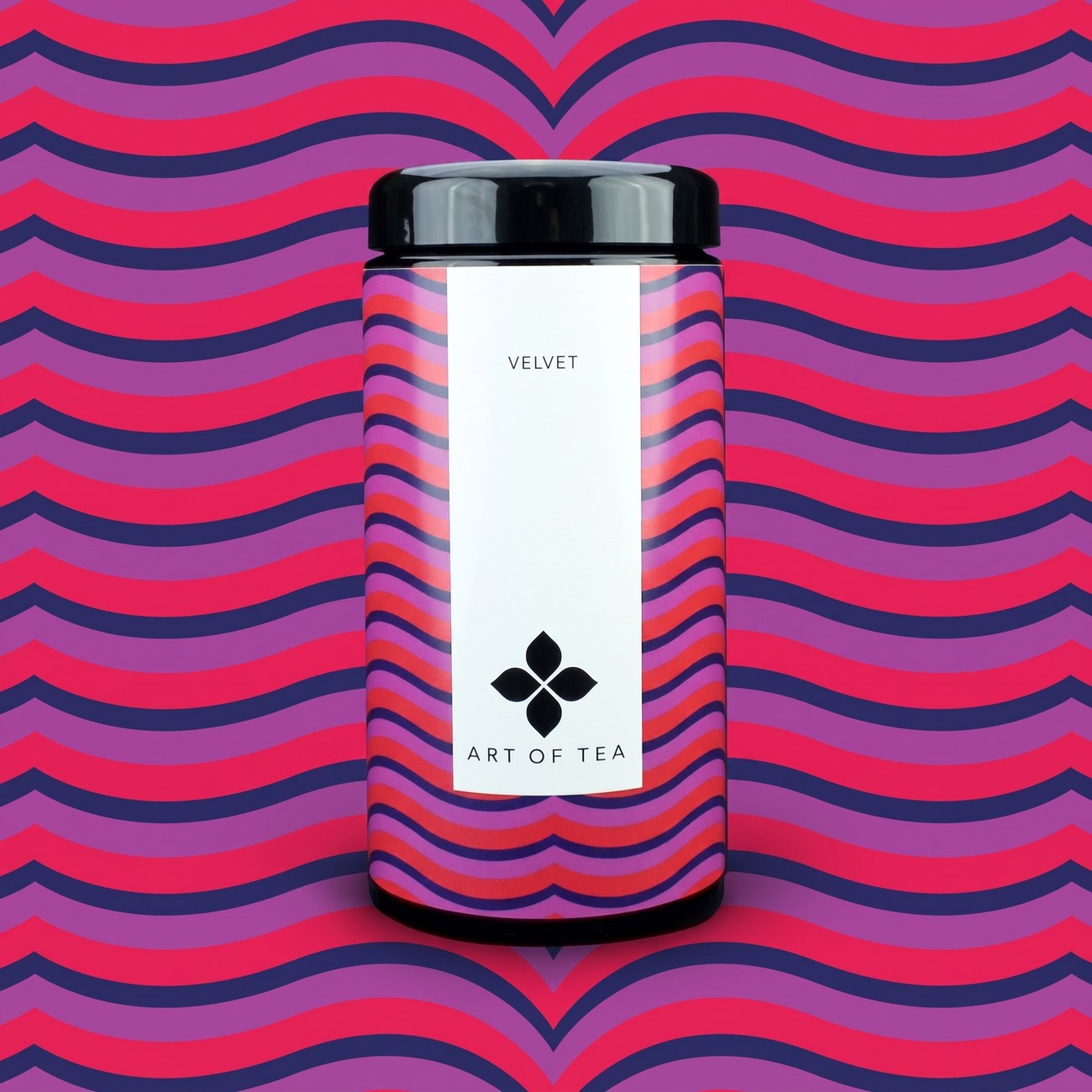
They didn't just design our packaging. They gave the brand its soul. A decade on, people still pick us up because of how it looks and what it says.
Commit
The system was built to grow. New blends, new patterns, the same framework. So the range could keep expanding for years without ever losing its identity.
The result
More than ten years later, the identity is still on shelves. Unchanged, and still working. Art of Tea grew into one of LA's most recognised tea brands, and the packaging became the thing people reach for.
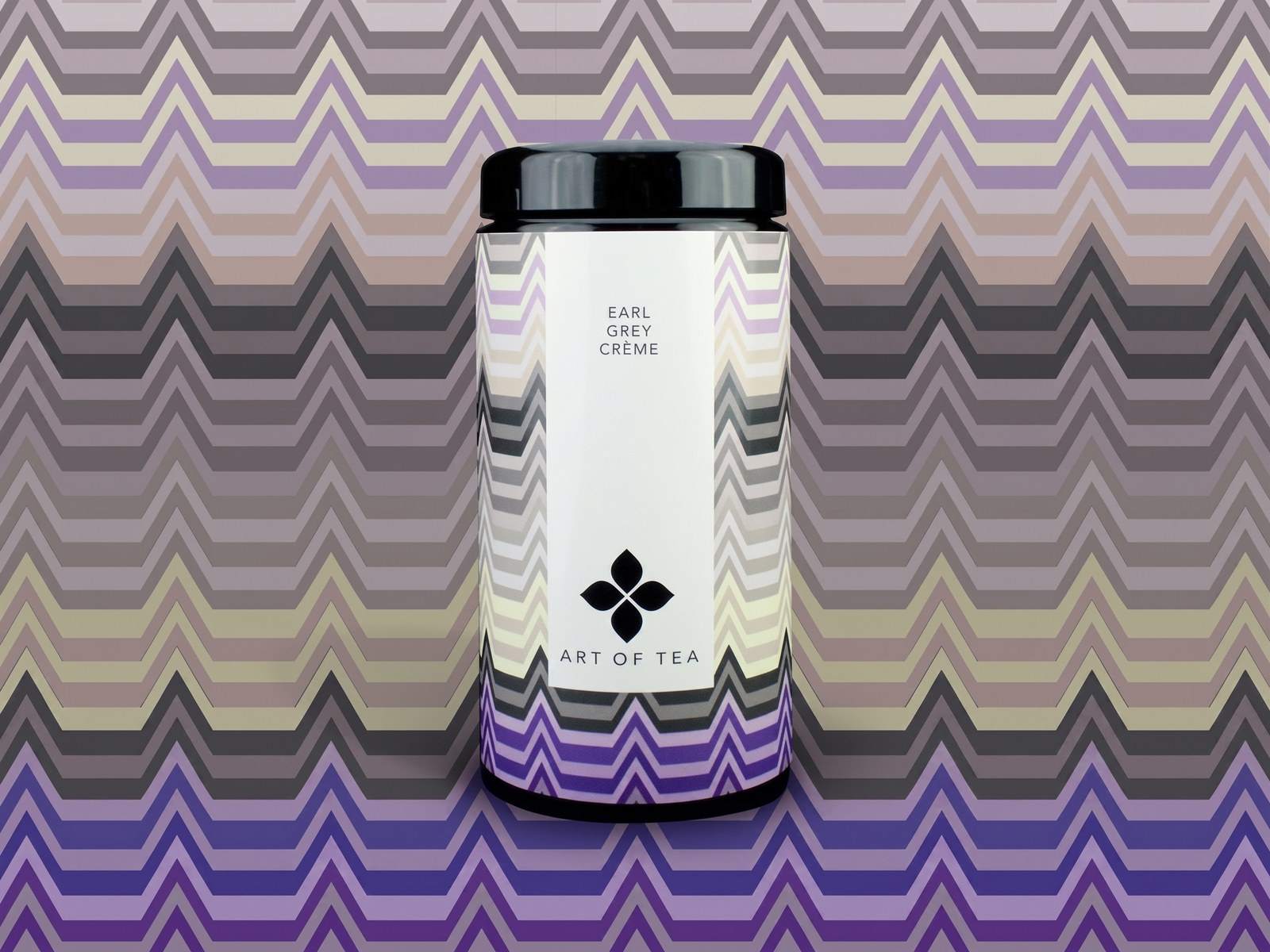
The craft
Brand identity, logo, a typographic label system and a bespoke pattern library. One framework, a different piece of art for every blend.